No doubt it works. Another forum I frequent started this a few years ago too but they managed to do do it using much less space. They also kept the amount of space for the username and avatar to a minimum also to maximize reading space for the posts.AndreTTOW wrote:While this would make it more attractive to forum users, it would not be good for business.one shot scott wrote:Rather than having the links to the products at the side it may be better at the top? This way aS you scroll down there is no dead space.
A left nav is always a better option. having a few quick links up top (like they already do) is quite fine, but most studies have show the left nav rules.
It gets the click, and that is by all accounts the most important thing here.
I presonally appreciate being able to access the info from the forum...but that's still besides the point. This format is tried and true in any website...it works.
FORMAT
Moderator: Excalibur Marketing Dude
Re: FORMAT
The most important blood trail leads to the Cross...
Phoenix
HHA Optimizer
Hawke scope
Boo strings
Boo tuned trigger
Phoenix
HHA Optimizer
Hawke scope
Boo strings
Boo tuned trigger
-
Brampton Mike
- Posts: 902
- Joined: Thu Oct 10, 2002 6:05 am
- Location: Brampton Ontario Canada
Re: FORMAT
If I can't hunt & fish in heaven....then I don't want to go!!!!!!!!!!
Vegetarian..............old Indian word for lousy hunter!
Vegetarian..............old Indian word for lousy hunter!
Re: FORMAT
Bill T wrote:I see now what's up. We get huge numbers of hits from people who are doing searches and get refered to the forum. Once in the forum they had no easy access to the website so this is an effort to get them to be able to enter and learn more about our products from the forum. We can talk this over with Peter when he gets back and see if we can make it less intrusive but please remember that this forum is supported by our sales and our first and formost obligation is to keep Excalibur bouncing and to keep bringing new converts into the family.
Bill and Peter and think I might have a solution that will benefit all, the Company (with their exposure to new people) and the regular forum members, just not sure if you can easily do it or not.Bill T wrote:Not quite.....
I said we will try to make it less of an issue, but we need to leave an easy way for outsiders to enter the website thru the forum
Make the DEFAULT forum browser the way it is now, and give an option to regular forum members to go into the control panel and choose an older version which will give us a wider area to view text and pictures without the need to slide the page back and forth.
I understand the need to expose new people to all aspects of the crossbow world, not just the forum, keep up the good work.
Tom
Tom
[img]http://hometown.aol.com/wingbonecall/images/turkey.gif[/img]
[img]http://hometown.aol.com/wingbonecall/images/turkey.gif[/img]
Re: FORMAT
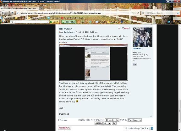
I like the idea of having the links, but the execution leaves a little to be desired on Firefox 5.0. Here is what it looks like on an full HD monitor.

The links on the left take up about 10% of the screen, which is fine. But the forum only takes up about 40% of whats left. The remaining 50% is just wasted space. I prefer the text smaller on my screen than most and in this format even short messages are many huge lines long. If the links on the left took the 10% and the forum took the rest it would be significantly better. The empty space on the sides aren't selling anything.
.02$
Duckhunt
Micro Wolverine/Matrix 350 SE
Recovering Excalaholic
Recovering Excalaholic
Re: FORMAT
"Simply Perfect" might apply to the xbows, but certainly NOT THE FORUM!!!! 
This is what I'm getting with Firefox in the "subsilver 2" preference setting:
Pardon my French, but WTF??!?!?

Here it is in "Prosilver" preference setting:
The names are on the RIGHT side (very confusing!) & the text column is way too narrow.
I've been logging on here to follow 2 or 3 threads only - can't stand to read through the forum in this unpleasant format. If the objective is to lose members then it's successful.
This is what I'm getting with Firefox in the "subsilver 2" preference setting:
Pardon my French, but WTF??!?!?
Here it is in "Prosilver" preference setting:
The names are on the RIGHT side (very confusing!) & the text column is way too narrow.
I've been logging on here to follow 2 or 3 threads only - can't stand to read through the forum in this unpleasant format.
________________
Sent from a mobile device - So spelling and grammar may be questionable!
---
"Team DryFire"
Vixen, Micro 315, HHA Optimizer, Boo & VixenMaster strings, Munch Mounts, Dr. Stirrup accessories.
Sent from a mobile device - So spelling and grammar may be questionable!
---
"Team DryFire"
Vixen, Micro 315, HHA Optimizer, Boo & VixenMaster strings, Munch Mounts, Dr. Stirrup accessories.